


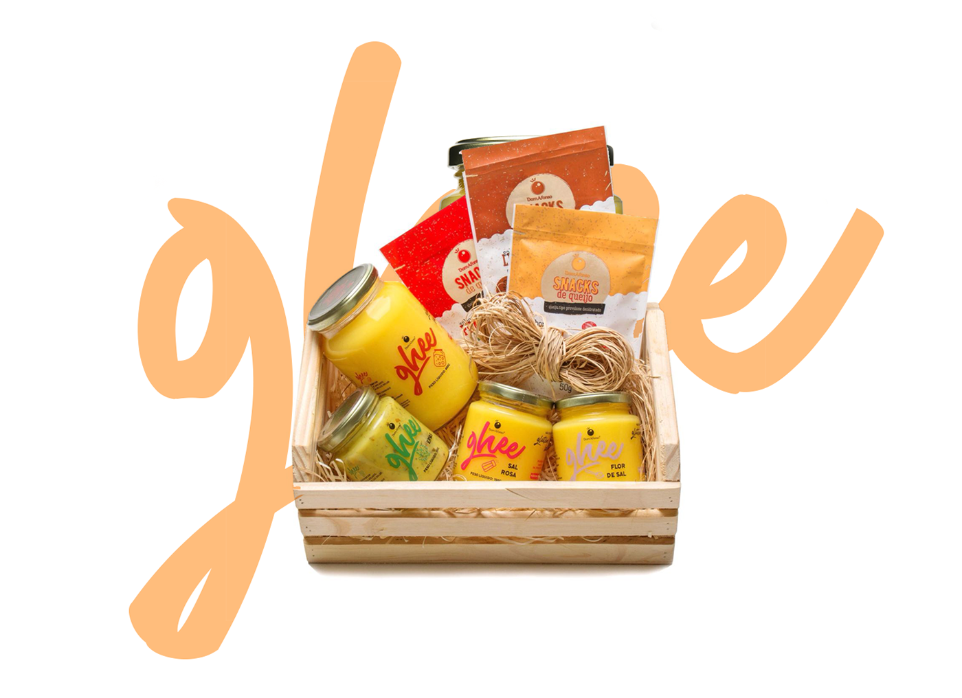
Seguindo a série de mudanças visuais para a nova fase da empresa no ano de 2018, que começaram com o redesign da linha de Snacks de Queijo, a Dom Afonso também apostou em uma nova identidade visual para sua linha de Ghees.
Com o desafio de dar um ar mais moderno, menos poluído aos produtos da empresa e harmônico em relação as embalagens dos Snacks de Queijos, criou-se um rótulo com mais espaços em branco para dar mais visibilidade a manteiga e com tipografia mais robusta, a fim de não comprometer a leitura das informações impressas.
_
Following the series of visual changes for a new phase of the company in the year 2018, which arose with the redesign of the Line of Cheese Snacks, a Dom Afonso also bet on a new visual identity for his Ghees line.
With the challenge of giving a more modern and less polluted visual to the company's products and more harmonic in relation to the Cheese Snacks, a label with more white spaces was created to give more visibility to the butter and with more robust typography, in order to do not compromise the reading of printed information.


✦ thank you for scrolling.
__________________________
✸ leave your like if you appreciate this project and some love on the comments section.
__________________________


